 |
| A Bulgarian 50 Leva banknote featuring Hristo G. Danov (1828 - 1911) and his printing press. Danov is considered the Bulgarian Gutenberg as he began the first large-scale book publishing in the country in the mid-19th century. Today, the Danov house is a Museum of Book Publishing in the town of Plovdiv where you can see his original platen press. Danov established a school, a bindery and a bookshop in Plovdiv, and contributed greatly to the development of Bulgarian education. During his lifetime, Danov printed over 1000 books and 900 educational training aids such as maps, atlases, globes and charts. Bulgaria's got it right. Their banknotes are beautiful designs and the concept of glorifying education and the printing press has the greatest currency value. :: Images via HappyHyde's Flickrstream |
Thursday, July 28, 2011
Printing Currency
Just Browsing
 |
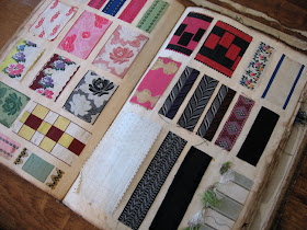
| Remnants from past studio sales at Addison Endpapers in Oakland, CA. The last big studio sale was held this past weekend before their big move to a new location. Wished I might have been there, but I'm only browsing. |
Wednesday, July 27, 2011
Penguin Duo Celebrates a Happy Ending
 |
Suggested Summer reading from designer Reece Ward who authored these lovely books. Ward happily lives with his wife Kerry and cat Brian in Manchester England. Both of his Penguin knock-offs are available as cards or prints at RedBubble. Perfect for any well-read newlyweds in your life. ::Via Teaching Literacy |
Circus Book Maximus
 |
Ruze z Pouti (translation, A Rose From the Fair) was written and designed in 1961 by Czech artist Zdenek Seydl, and sent as a New Year's wish to clients and friends of music and book publisher, SNKLHU in Prague. (The book originally included a gramophone record as an insertion and was published in an edition of 2000). I first discovered this wonderful book on the Flickrstream of JosefSkrhola. Seydl (1916–1978) was a prolific designer, illustrator, painter, stage and costume designer, toy designer, book designer, and author. He trained as a typographer's apprentice early in his career which influenced much of his later work. I can't help believing Seydl was somewhat influenced by the work of Paul Rand in his 1957 children's book, Sparkle and Spin, when designing the dust cover of Ruze z Pouti. This is a fair comparison if you check out the link and see the FAIR page spread. This takes nothing away from Seydl's work however, as the guy was brilliant. I can promise this won't be the last of it you find here either. |
 |
| Front dust jacket cover of Ruze z Pouti at top. Back cover just above. |
 |
| I am presuming this ABRAKADABRA design above is on the actual front cover board, but I have only seen the book in photos. |
 |
| Title page spread. |


 | ||
Front cover of envelope package with publisher's name, SNKLHU.
|
Tuesday, July 26, 2011
Novel Ideas
 |
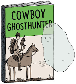
| Four more droll illustrations of suggested titles by Tom Gauld for a Washington Post Book Review article on genre fiction. As Gauld describes them—the cozy murder-mystery, the steampunk romance novel, the supernatural western, and the most over-saturated genre—the vampire fantasy novel. Take a good look at more of his irreverent work on his Flickrstream. |
Sunday, July 24, 2011
Yours Truly
 |
| If you happen to have made it to the first Cincinnati Type-in recently, you may have seen these lovely letterheads from various typewriter companies. Richard P, featured the letterheads above on his blog Writing Ball. They were contributed by Peter Weil who writes the typewriter Ephemera column for Richard's journal ETCetera: Journal of the Early Typewriter's Association. They are full-size scans available from himself truly. Taking a Q from Writing Ball, the 5 letterheads you see below from various Swiss typewriter companies were recently added by Shordzi on his Sommeregger blog. He kindly made them available for downloading here. Unfortunately there is no way to duplicate that metallic silver of the Baggenstos Hermes letterhead. Thanks for sharing guys!      The letterhead in the IBM Selectric below isn't available for download at this time. Nice display of Gill Sans Light, which would benefit even more from some kerning.  |
Friday, July 22, 2011
Tina on Olivetti
 |
| I don't know how I missed this earlier, but Tina Fey fingers the keyboard of a Lettera 22 Olivetti for the Spring edition of Bust Magazine in 2004. I bet she was right on key too! Thanks OzTypewriter! |
Thursday, July 21, 2011
Alphabetica Rustica
 |
| The above two images from Michael Hochleitner's Flickrstream of the ephemera collection at the University of Reading. The B here must stand for Bucolic. |
 |
| Alexander Anderson woodcut from the NY Public Library archive. |
 |
| Dutch alphabet book from Geheugen van Nederland. |
 |
| Post card for sale on Etsy for $7. |
 |
| Page in a late 19th Century almanac from the Letterology Archives. |
 |
| Charming pin. Wish I remember where I found it, and sure wish I owned it! |
 |
| Flip side of a carte de visite from the Letterology Archives. |
 |
| From some book of mine, but don't have a clue which book. |
 |
| Wonderful cover of Imballaggio Magazine designed by Max Huber. From Sandi Vincent's Flickrstream. |
 |
| From the 1903 penmanship book, Designs for Letters and Monograms, by John B. Wiggins Co. You can see more in an earlier post here. This is Part 1 in what may be a continuing series of rustic typography. I'm just a nature girl at heart who loves woodsy letters. |


