 |
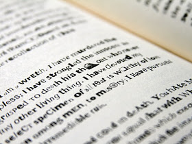
| Mary Shelley's Frankenstein, reinvented from fragments of PDF fonts by the team at Fathom Information Design in Boston. A team of visual storytellers from Fathom lead by data-viz wiz Ben Fry, recently recreated the entire text of Frankenstein using characters and glyphs from over 64,000 PDF documents obtained through internet searches. Precisely 55,382 different glyph shapes were extracted from 347,565 fonts in the PDFs, which were then coded and sequenced to fill all of the 342,889 individual letters found in the Frankenstein text. What emerges from this DNA-like sequencing is a new Frankenfont creation formed from font fragments by Fathoms' Fry and friends. The story opens with the display of the most common characters such as Arial, Helvetica and Times New Roman. As the story of the Frankenstein monster evolves, so does the text which is coded to completely devolve into grotesque shapes near the end. Familiar glyphs and fonts merge into obscure scripts; non-Roman fonts begin to appear; and even typefaces morph into pictograms. This Frankenfont transformation becomes the perfect metaphor for Shelley's classic tale of the deformed monster Frankenstein. |
 |
| While most books are typically designed to interpret the authors' words with little fanfare and with an obedience to convention as Stanley Morrison once put it, Fry's new Frankenfont edition plays with our sense of order, and the traditional design principles such as consistency, navigation and readability go entirely out the window. As a teacher of book design and typography for many years, I strongly advocate these principles of convention to my students. Afterall, books have been successfully published in this manner for over 500 years. Despite this endorsement, I'm also a big fan of innovation and experimentation in books. In Fry's edition of Frankenstein, a hallmark of book design and innovation has been reached with this conceptual approach to text layout. As a timely sidenote to this story, the topic of a frankenfont came up in my classroom just 2 weeks ago when Kevin Larson from the Advanced Reading Technologies Department at Microsoft, was speaking to my students about readability studies of various typefonts and individual characters. Larson is a text enthusiast and has published many studies on the science of word recognition and legibility of characters. The suggestion of a frankenfont was mentioned in jest as one which could build upon the best characters of many fonts in order to achieve greater legibility. The next day, my student Susan Schumacher added a post on our class Facebook page with a link to Fathom's new Frankenfont edition of Frankenstein. Copies of the Frankenfont project can be purchased in paperback or hardback editions on Blurb with all profits given to Donors Choose to buy books for students. Incidently, Ben Fry was recently awarded a National Design Award in Interaction Design in June from the Smithsonian's Cooper-Hewitt National Design Museum. |
 |
| All of the nearly 5500 unique words to be found in Mary Shelley's Frankenstein. (Click image to expand). The key to any great novel is to put them all in the right place ; ) :: Thanks to James Gaddy of Co.Design for packaging this story so nicely. |


No comments:
Post a Comment
Note: Only a member of this blog may post a comment.