Wednesday, November 30, 2011

So You Want to Be an Artist

Here's a way to create and learn without getting your hands messy. Learn to print linocuts like Edward Bawden or create sculptures from natural materials like Andy Goldsworthy or illustrate a children's book like Sarah Dyer. These artists and so many more demonstrate their specialized skills in videos and interactive demos where everyone is an artist. You can choose from textile arts, photography, wire sculpture, screenprinting, and dozens more materials. When completed, you can post your artworks in a gallery, print them and even email them to friends. It is fun for all ages, all brought to you by the imaginations of  the people behind the site ArtisanCam in the UK. 
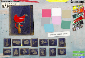
Learn about Edward Bawden and his Kew Gardens poster work for the London Underground.

So I tried my hand at printing some of his linocuts by choosing an ink color, then the brayer and the paper...


Voila! I made a print. There is an opportunity to make a collage from all of your prints, but I quickly gave up after getting the sticky-scissors-of-death and I bailed. Next I tried screen printing

Then I tried to make a book and draw like Sarah Dyer, but quickly learned I had to use her images to tell the story. I gave that up after I couldn't make the virtual pencil work. I think you have to be 8 years old in order to know how to write with it.


I couldn't get past the over-muscled superheroes at this venue, but don't let it stop you from trying it.


Been there, done this already, but I think it is a wonderful exercise and virtual introduction to making books. Think I may go on a photoshoot or make a visit to sculpturama now. This beats learning to draw from a matchbook cover which is pretty much where I began, but what they really need here is a how to balance your checkbook or how to eek out a living with potato prints right at home. 

Tuesday, November 29, 2011

18th & 19th Century German Logos

This album of German logos and emblems, contains more than 1000 specimens ranging from eyeglass manufacturers, blacksmiths, seal and saddle makers, tobacco sellers, and fishing rod makers. Most are woodcut and engraved images with some of many colors, and they are in relative fine condition considering many are now nearly 300 years old. Near as I can tell, this fine collection still seems to be on the auction table at KettererKunst with a suggested price of $10,530. 
Time to tweet Santa!


Monday, November 28, 2011

Brief on Brázda

Co se slovy Všechno poví, (or rough google-translation: The Words Tell You Everything) published by SNDK in Prague in 1964. It was playfully designed and illustrated by Pavel Brázda and his wife Vera Brázda and I can only presume it was considered to be a children's book. Maybe so, but the typographic illustrations and the degree of modern design and layout lead me to think this book is fit for a much older audience. Below are just a few of the 45 interior pages from this book.
:: Found at 108 Buddhas.


Until this book caught my eye, I had never heard of Pavel Brázda (1926- ), but I found he is a wildly prolific and imaginative artist of many styles; from a magical realism, to pop art and expressionism. Every bit an individualist, he was expelled from 3 different art acadamy's in his youth. He later attended the Higher School of Art and Design and was allowed to make a living as a so-called professional artist, but he has always carved his own path. His first large exhibition was organized in 1992 and a series of exhibitions in Prague galleries followed. A few of my most favorite works of his are the race car images below from 2003. They are reproduced from a series of paintings he made nearly 40 years earlier. You can find the editioned serigraphs for sale here.


Further explorations lead me to find the display font Brzda from Suitcase Type Foundry in Prague. It was designed specifically for a solo exhibit and book of Pavel Brázda's and it was inspired by the street motifs of his paintings. Very fine! 

Sunday, November 27, 2011

Back to Nature, Part 2

With all the leaves nearly off the maple trees outside, it seems a good time to add another post on the other sort of wood type: the common twig type. Also referred to as rustic type or broken log lettering, it evolved from branches, sticks and twigs and an appreciation of the natural world. I find that these woodsy letters can easily reveal themselves just by gazing up into the newly exposed and barren branches of large trees. I imagine this must have been a popular pastime in the later 19th century as well, when a back to nature theme took root in Victorian society and rustic twig typography became high fashion. Such fine examples of it could be found on songsheets, childrens' books, advertising trade cards and more.
      The Oliver Alphabet booklet above is from 1889. It is an advertising alphabet pamphlet for children and adults produced by the Oliver Chilled Plow Works. Each ornate letter in the booklet is lavishly illustrated to emphasize the many features of the plow. You can see more images of this booklet at Bromer Booksellers and Aleph-Bet Books.
      Immediately below is the cover for Rustic Adornments for Homes of Taste, published in London in 1856. It was designed to inspire town folk to imitate nature indoors. From the Special Collections of the Geffrye Museum.


The songbook cover above from 1878 has some nice log type with an initial Cap H of shafts of wheat and a sickle.
:: Via Crackdog's Flickrstream.

An exquisite chromolith title page from an 1881 autograph album belonging to designer/illustrator Julie Reed who writes the inspired blog Bricolage

Portion of a tattered songbook cover from mid-1800's from my own collection.


Cloth-stamped cover and title page of Mother Goose in Hieroglyphics. This is a 1962 reprint by Houghton Mifflin from my own bookshelf. 
Edward Ardizzone's illustration for the catalog cover of the 1951 Festival of Britain exhibition. Printed letterpress from 4-color line blocks and featured in the 1953 Penrose Annual, Volume 47.  

Davies' Naturalist's Guide, 1858, a guidebook for collecting, preparing and preserving specimens in arsenic intended for students, amateurs and travelers. 
:: Via the Smithsonian Galaxy of Images.

1889 advertisement for Perkins & Company of Grand Rapids, Michigan, a manufacturer of machinery for making cedar shingles. 
:: Via the Smithsonian Galaxy of Images. 


Rustic letters and monogram from my 1903 penmanship handbook by John B. Wiggins, Designs for Letters and Monograms. Find many more of my posts from this book here


Not that kind. This image is from an edition of 50 silkscreened prints of the ornithological kind by type designer and illustrator Seb Lester. It features 4 famous tits sitting on twig letters. Just a few of these prints left for sale at the Keep Calm Gallery.


This beautifully illustrated songsheet for Woodland Sketches published in 1851 was found over at What is This?. Lithographed in 2 colors, and then hand-colored in watercolors. It contains several woodsy typestyles surrounded by a rustic arbor border, all designed by some unsung twig type hero. Stunning!
      You can find more examples of typographys' sticks and stems in this continuing Letterology series at part 1, Alphabetica Rustica.

Thursday, November 24, 2011

Cranberry Bold

Comes frozen and pairs nicely with frozen Turkey TV Dinner Bold. Serve chilled in a glass with Wild Turkey for that warm all over feeling inside. Cheers, and happy Thanksgiving!
:: Via 101 Outfits.

Wednesday, November 23, 2011

Carte du Jour

Thanksgiving frogs? More menus from the New York Public Library's Buttolph Menu collection which contains menus from 1851 to 1930. These happen to all date between 1897 and 1900. See more menus with lovely handmade letterforms posted here


Tuesday, November 22, 2011

Put A Bird In It.

Maison de Julia. Fit for a literary birdbrain and comes ready to serve. 
:: From Uncommon Goods.