Friday, September 28, 2012

Obsessive Compulsive Designers

Before

After

ABCs for OCDers: alphabet soup by design comes from the clever mind of Swiss performer, artist, comedian, author AND typographer, Ursus Wehrli. It is featured in his third book, Die Kunst Aufzuräumen; soon-to-be-released in English as The Art of Tidying UpAll three of his books about tidying up everything from famous artworks to french fries are part of his campaign to recreate a new world order. The perfect gift for any obsessive compulsive designer who rearranges their bookshelves by color. You know who you are!
     His most recent orderly creation is for the Swiss Post office, where he deconstructed an image of the iconic Swiss clock signaling the efficiency of their train schedules. You can also catch him doing a crazy Ted talk here.   

Wednesday, September 26, 2012

It's a Pantone World

Hard to beat this old pantone ink chart from UK artist Martin O'Neills' screenprinting days—unless—he were to get the royal queen colour guide.
But then he would always have to wear white gloves whenever handling.


The "Diamond Jubilee Colour Guide" by Pantone. Produced by Leo Burnett London.
::The Queen's hat tip to Design Boom for her colour guide.

Tuesday, September 25, 2012

Punctu@t!on Matters!

National Punctuation Day sort of escaped me yesterday, but I didn't want to 
let it go by entirely unnoticed here at Letterology. To put a finer point on it...
visual communication relies on punctuation. It reminds us when to breath, 
when to stop, when to pepper our speech with enthusiasm, and when to 
question. It behaves as signposts and wayfinders to help us navigate language, 
and signal action. Punctuation characters are the supporting cast for all the 
other 26 letters of our alphabet. Without them, words fail and language has no 
texture. 
     Learning when and where to apply punctuation is a perennial challenge at 
times—certainly for me that is! Then there are the diverse styles of marks—
each with various features, which we seldom see as we are too busy paying 
dues to 26 U&lc letters. By comparison, the marks may seem inconsequential, 
but enlarge them 800% and you will discover they all have distinct features. 
One of the best graphic examples I've seen of this is Heidi Neilson's 2003 book, 
Typography of the PeriodIt is a visual information guide examining the 
diversity of the period. Delightful, and one I always saved to show my type 
students in the past.


In the page spreads above you see a Jenson period and a Papyrus period.
     The many exclamation marks at top are in order of appearance from left to right: Avenir 
Regular; Bank Gothic Medium; Bodoni Book; Centaur Regular; Century Schoolbook Bold; Cooper Black Regular; Eurostile Bold; Agenda Bold; Gotham Bold; Optima Bold; Grand Central Bold; Adobe Jenson Pro Bold; Stone Sans Semi; Franklin Gothic Med Regular; and Whitney HTF Bold.

And a few punctuation haikus from National Punctuation Day:

Alas my text friend
Punctuation's gone again
How do I read this?
- Larry McGee

Exclamation point
means "I am so excited!"
CAPS LOCK is just loud
- Morgan O'Brien

I love the em dash.
It's a lot easier than
The 50-yard one.
- Lex Friedman

Friday, September 21, 2012

A Short History of Typewriters With Blackletter

While continuing on the theme of fraktur—or blackletter type in this case...
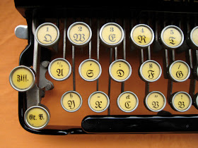
I cannot overlook the monospaced typewriter versions. Blackletter typewriters (otherwise referred to as frakturschrift in German), are difficult to find today, as they were made mostly for the German market up until 1941. German authorities outlawed the use of Blackletters at that time as they considered them to be "Jewish letters", and as I reported earlier this week, Blackletter virtually disappeared from print for nearly 50 years. Not until Disneyland adopted the use of a stylized Blackletter for their logotype in the mid-1950s, did it begin to see a reemergence. In the 1990s, Blackletter's revival was truly sparked when many styles began to be digitized, and their proliferation has continued to steadily increase ever since that time.
     The Blackletter keyboard layout above is from my Flickrfriend, Georg Sommeregger's beautiful 1933 Urania Piccola (I'm guessing an Italian typewriter?) You can also see a nice monospaced typewritten sample from it which he posted here


This keyboard example comes from the partially working 1903 German Remington No. 7 below. Proud owner, Olivander tells the happy story of its' revival over on Collapsing World. Despite the 30 year difference in age of these two typewriters, the differences in the two manufacturers' Blackletter fonts are quite subtle. 

This 1926 Senta 3-bank portable typewriter from Germany belongs to Adwoa at RetroTech Geneva. You can read more on the blackletter typewriters there and find some good links including this one for a free download of the F25 Blackletter Typewriter font 


A keyboard sample of the Blackletter on the Senta typewriter.

Thursday, September 20, 2012

The Fractur, Part 2


More Fractur goodness here today in Part 2. In case you missed it, here is Part 1.
     The two handpainted birth certificate frakturs above are for brother and sister, Joseph and Margaret Spengler, dating to the 1700s. They were expected to fetch between $50,000 and $100,00 at auction last year. They were believed to be painted by a Rev. Heinrich Diefenbach, a fraktur artist and theology student. The thing I find so charming about frakturs is how they never used perspective in their illustrations, giving them a naïve, folk-art character. They are flat, and two-dimensional, with no shading nor diminishing vanishing points. This is very evident in these two fracturs above showing each subject standing in a garden with the text layered on top of the soil. 

Handcolored and handlettered religious text with much ornamentation by Martin Godshal, circa 1835. 
Handpainted and handlettered birth and baptismal certificate circa 1773, Pennsylvania.


Fraktur alphabet created around 1825-1850 in Pennsylvania. Find larger sizes
here
. Line-for-line transcription from right to left reads:
A H P W, B I Q X, C K R Y, D L S Z, E M T E, F N U V, G O V E
Writing Exercise by Johannes B. Miller, circa 1830. For transcription of the text, read here 
Handpainted and handlettered in an embroidery pattern by artist and schoolmaster Johann Adam Eyer in 1810. 

Writing exercise by Catharina Murry in 1801. For transcription, see here

Writing exercise in German circa 1800, Pennsylvania. See for translation.


Book inscription with cup and alphabet, by Elisabeth Schwob, circa 1819

Hand-drawn and colored by Henry Young in 1829 for Catharine McKnight. 
Fraktur artist toolkit. Inside the various compartments are tools, such as a straightedge made from bone, pen nibs and containers for dried pigment. Artists also carried design examples such as the colored images of geometric motifs, and various clippings of printed verses like those below featuring printed text in Blackletter, documenting a dialogue between God and Adam and Eve.   


:: All images are courtesy of the Free Library of Philadelphia where there is much more Fraktur goodness. 

Tuesday, September 18, 2012

Best Book Trailer Yet

Fred nails it! Even down to the typewriter on the desk! 
::Thank you Kitri!

Sunday, September 16, 2012

Rocks in My Head


I Am Not an Idiot, 2010 by Belgian conceptual artist Kris Martin. The found stones were on exhibit at Sies + Höke gallery in Düsseldorf, 2011. 
::PietMondriaan via this isn't happiness

Rocks are records of events that took place at the 
time they formed. They are books. They have a different vocabulary, a different alphabet, but you learn how to read them. —John McPhee

Or they ARE the alphabet, as in the U&lc pebble alphabets found by Belgian designer and typographer Clotilde Olyff, who collected them over the course of 14 years from the banks of rivers and oceans. These are images from her 
book, Lettered by Jan Middendorp and published by Druk Editions, 2000. 
::Via Grain Edit


Saturday, September 15, 2012

Illuminated Fraktur

A vibrantly illuminated Fraktur Vorschrift from 1821. The text is from Ephesians, 6:10-12, and followed by a lowercase alphabet, an uppercase alphabet, and numbers from 1 to 500. It is currently up for auction on eBay and you can read the text of it there
A brief history
In type circles, the term fraktur is commonly known as a lettering style marked by "fractured" or broken pen strokes, often referred to as gothic or blackletter. After WWII, blackletter was nearly forgotten, but has lately seen an astonishing revival and developed into a typographical trend, according to Judith Schalansky who authored the 2008 book, Fraktur Mon Amour. Traditionally, the term fraktur was rooted in European folk culture, most associated with Germanic people. Since the mid-18th century, Fraktur also came to mean the folk art form of elaborately decorated manuscripts practiced in the Pennsylvania Dutch country by European immigrant families. The documents were often religious in nature or celebrating the social passages of births, baptism, marriage, and death. They also served as rewards of merit or scholarship among students, and tokens of friendship and love. 
     Common to many was the distinctive German handlettering of the fraktur style. Some of the earliest Frakturs were illustrated and handlettered by itinerant artists and neighborhood scribes who had little education, nor spellcheckers. Schoolmasters and clergymen also took on this roll, as well as many talented, but nameless artists and printers. In later works, the text was often printed, and artists would then add color and freehand drawings of plants, animals and fancy borders. Comparatively few were ever signed.


I admit I know very little about the different types of Frakturs and had to consult the Fraktur Web for more information about this sort called Vorschrift Fraktur as seen here. Among scholars, the Vorschrift Frakturs are considered to be the most beautiful and most artfully produced. They tended to have elaborate decorated caps, titles, larger first lines and colorful border illumination. The lettering often consisted of Bible verses or hymns, and far surpassed others in design and appearance. Many scholars identify the golden age of Frakturs to be the period 1790-1830. The 1821 example seen here is typical of a Vorschrift Fraktur. I hope to add more great examples, and less talk of Frakturs in the days to come.